medbee

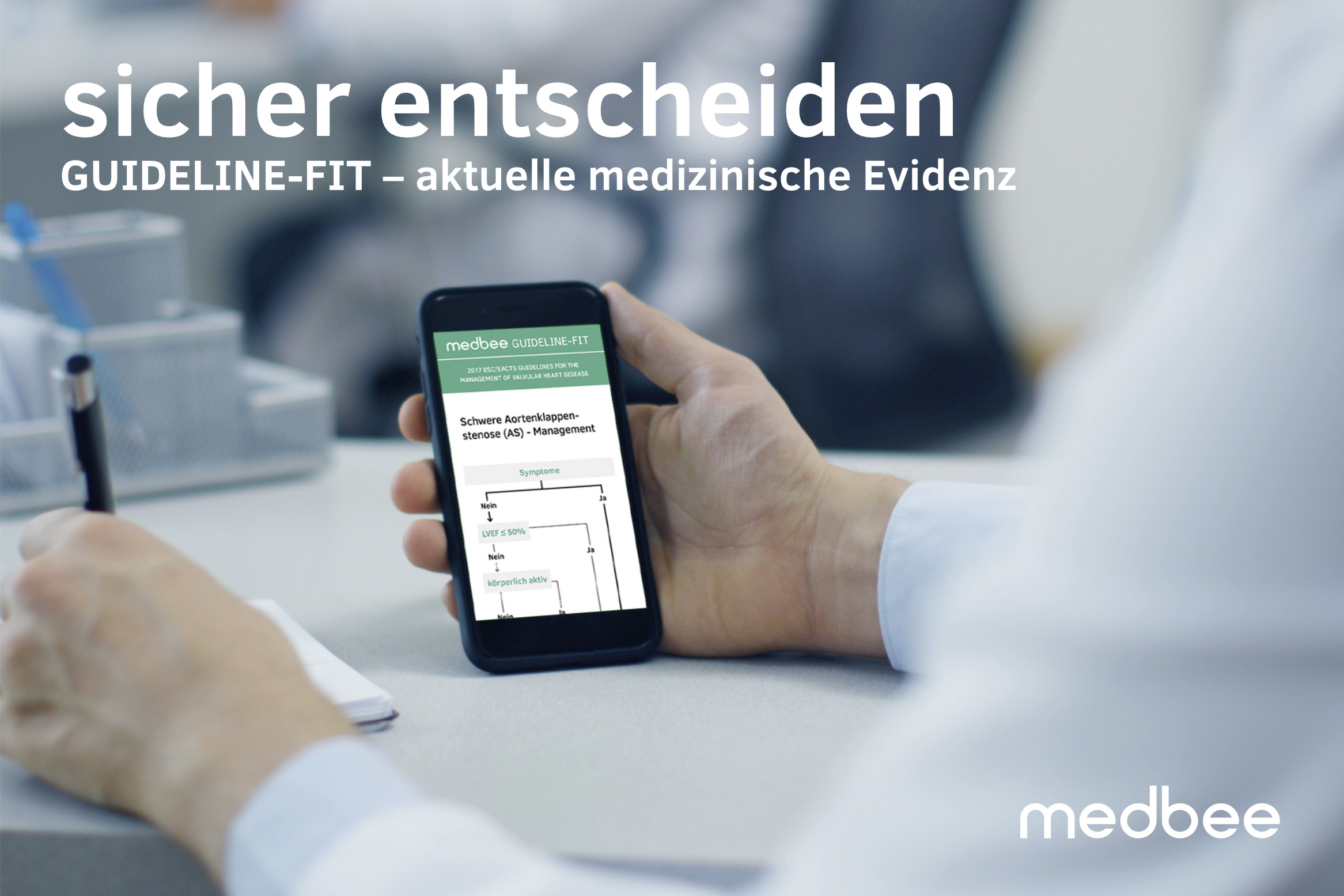
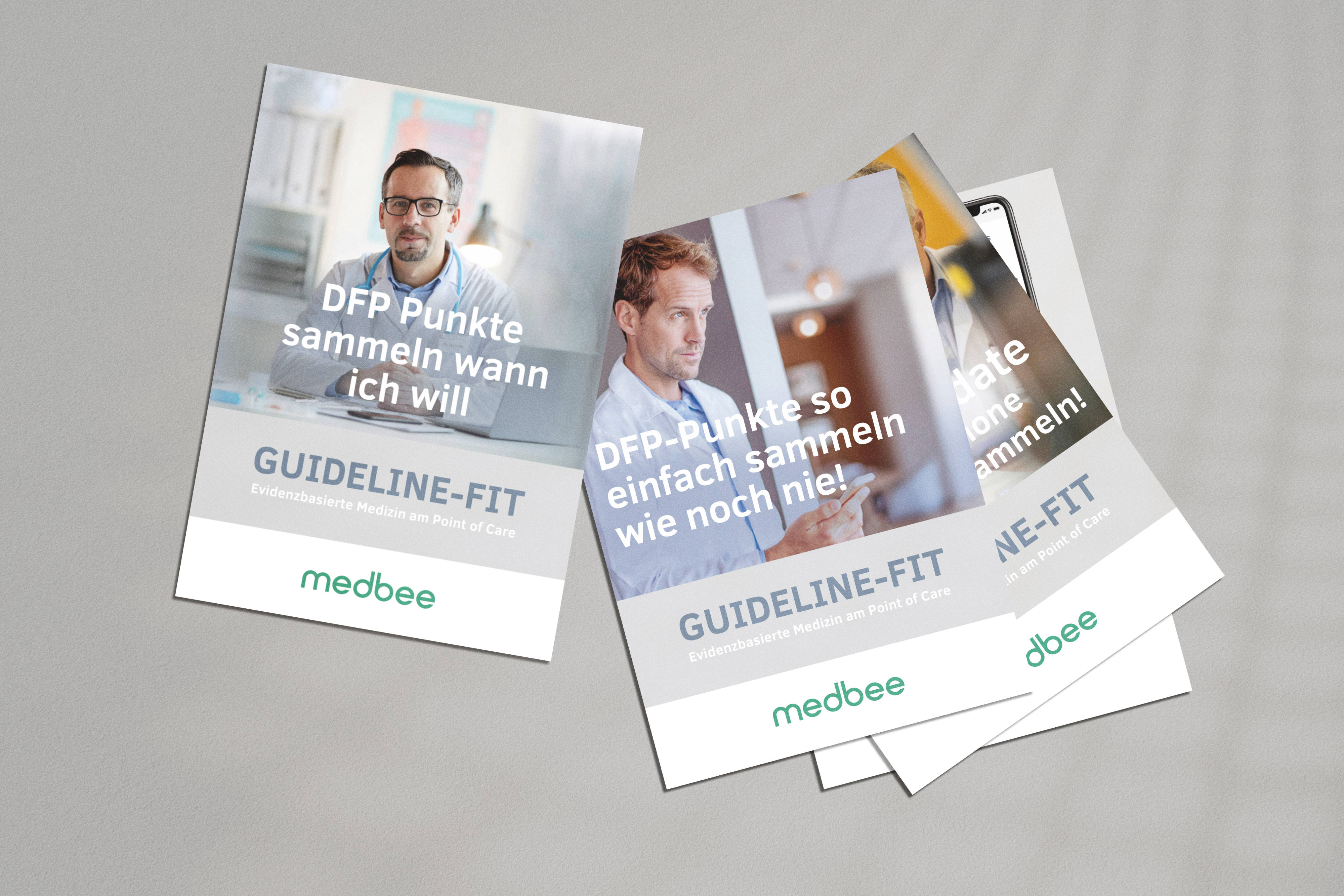
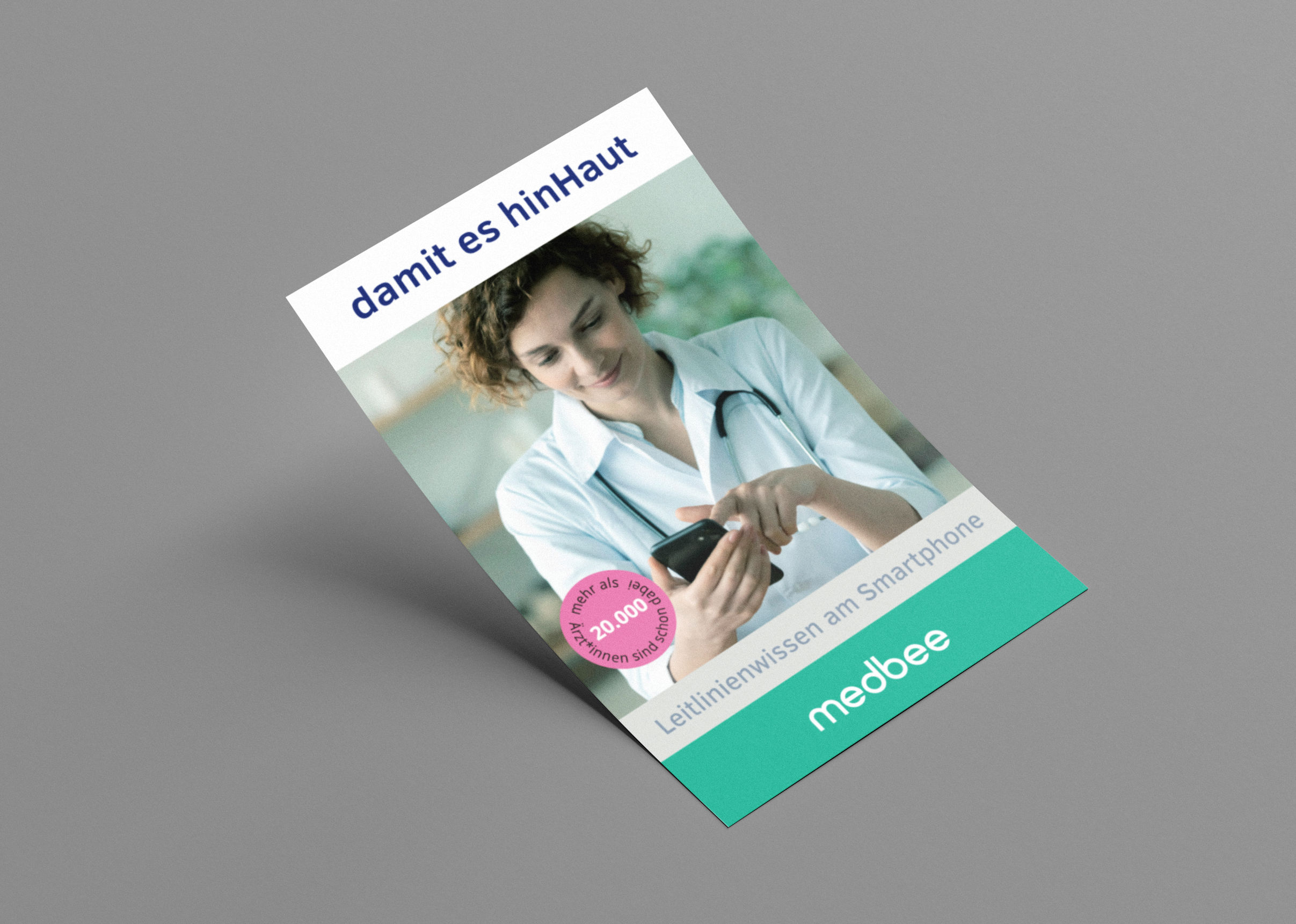
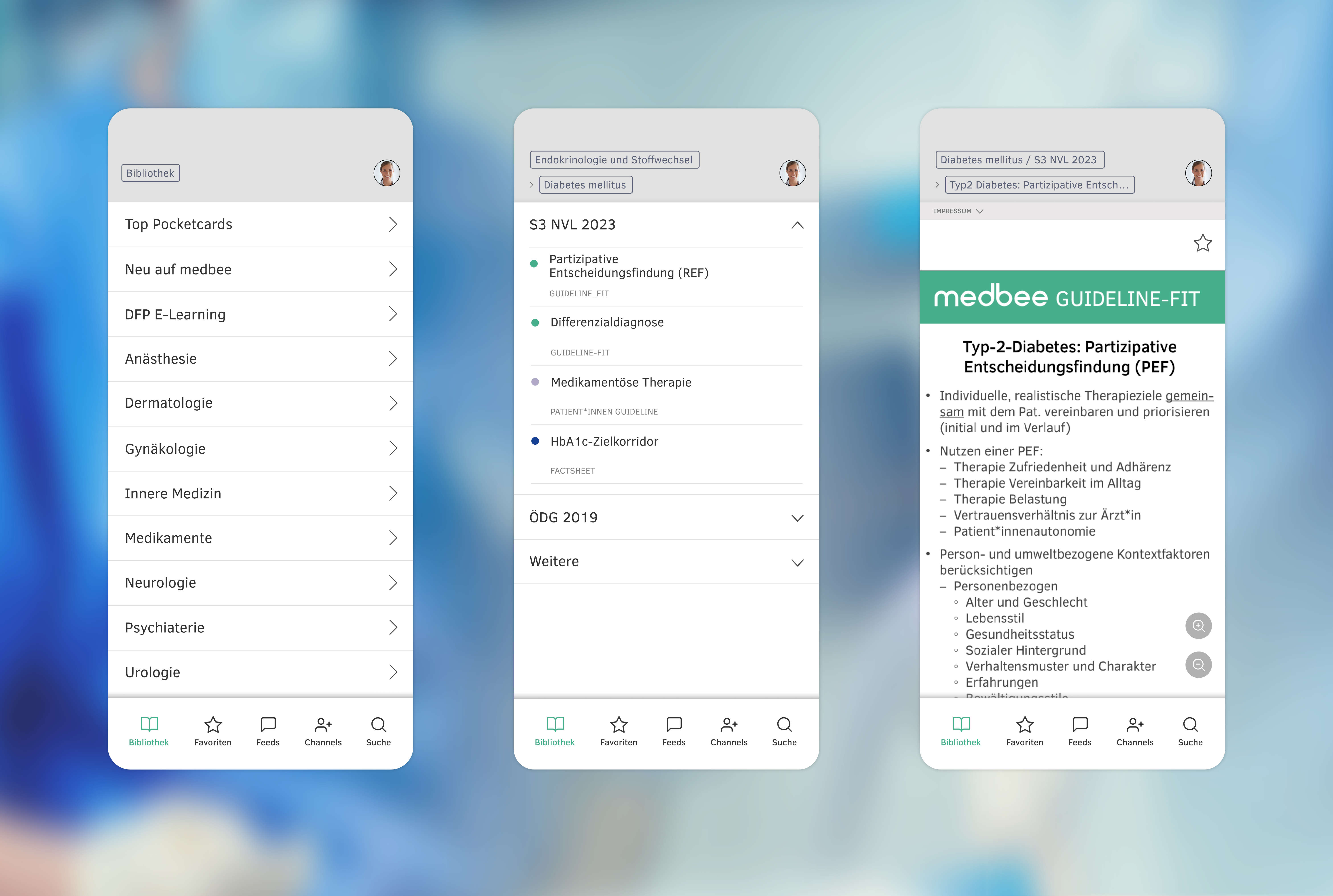
A redesign of the medbee brand and app. Simultaneously to the extensive brand identity the entire advertising line was redesigned. medbee's medical competence as a platform for the latest scientific content should be clearly visible in the identity. Possible irritation in the communication due to ambivalent sign settings was eliminated by a single-color lettering. After analysis of the brand identity, the new logo is adapted to well-known codes such as color and objectivity of the medical industry.
Ein Re-Design der Marke und der App von medbee. Zu dem umfangreichen Markenauftritt wurde zeitgleich die gesamte Werbelinie neu ausgerichtet. Ziel ist es, der medizinischen Kompetenz von medbee, als Plattform für aktuellste wissenschaftliche Inhalte, auch in der CI gerecht zu werden. Mögliche Irritation in der Kommunikation durch ambivalente Zeichensetzungen wurde durch einen einfarbigen Schriftzug behoben. Nach Analyse des Markenauftritts, ist das neue Logo auf bekannte Codes wie Farbe und Sachlichkeit der medizinischen Branche abgestimmt.
brand design, animation: Manfred Veigl
web design, app design: Gerald Baumgartner